 A huge, on-going mission for marketers and business owners alike is to increase their website traffic. What is commonly overlooked, however, is the amount of conversions resulting from that traffic. Conversion rates are the percentages of customers who take a certain action on your website, whether it be downloading your latest white paper, subscribing to your blog, or above all else, making a purchase. Website traffic is great and all, but without conversions it is as disappointing and useless as having a store full of customers without a single sale or connection being made. Fortunately, there are countless strategies and resources available that can help transform your website into a conversion machine. Here are 6 ways to increase your website conversion rate that you can implement today:
1) Optimize your homepage
In the current digital world, website homepages act as the first impression between a customer and a business. And you know how important first impressions can be. The days of a personal, face-to-face connections as the first point of contact are long gone. Think about that last time you heard something about a business you were unfamiliar with that sparked your interest. What’s the very first thing you did? If you’re like me, then you Googled it and clicked the first search result: the homepage. A lot of your potential customers will do the same thing, so it's crucial to optimize your homepage to make a lasting first impression. The first thing that your website visitors should know is exactly who you are, what you do, and the value that your products and/or services will provide them. I can't tell you how many times I've visited a website and, after a thorough review, had no idea what the business was offering.
Your website design and visual elements also play a critical role in whether visitors will decide to read what you have to say and stay on your website. Colorful visuals increase people’s willingness to read a piece of content by an astounding 80%, and readers' attention spans and recall by 82%. Not only are visitors more likely to read your content, but they are also much more likely to remember.
Now that you have encouraged them to read and remember your home page content, what's next? Make your website easy to navigate. I know this sounds like common sense, but you’d be surprised how many websites’ navigation structures are similar to playing a game of Labyrinth. Along with reducing your website bounce rate, clearly defined navigation menus, like buttons and links, significantly improve your visitors' pages-per-visit and session duration. I have quite the story for you on this matter, but we’ll get to that soon.
2) Use calls-to-action and landing pages
Calls-to-action (CTAs) are meant to provoke an immediate response from your website visitors and are a critical component for increasing your website conversion rate. CTAs gained tremendous popularity with the rise of inbound marketing and remain one of the most effective methods for getting quality leads. They can be located anywhere from a blog sidebar to a pop-up that appears in the middle of your screen, and are most commonly associated with landing pages. But as you can image, not all CTAs have been exactly effective – but have instead produced contrary results. Let's focus on what to and not to include in CTAs, and take a look at some examples. CTAs come in many shapes and sizes, but the most effective tend to offer pertinent, valuable, and (most often) free content in exchange for an email address.
There are 3 things to consider when developing your CTAs:
1) The first thing you should think about is what you're going to offer to your website visitors. Can you offer any informative white papers? Ebooks? “Best Practices” guides? Blogs? Photos? Free trials? If you can, then you’re already on the right track to increasing your website conversion rate. Developing and offering great content for CTAs will be the ultimate determinant of overall effectiveness.
2) Next, you need to focus on your title and description. When it comes to CTAs, less is more. Hook your audiences' attention with a bold headline, and reel them in with a short description of the value your offering will provide.
3) You also need to be mindful of the words you choose for your form button. People often associate “subscribe” with a subscription that requires payment, even if what you’re offering is free. Terms like “Download now,” “Get Your Free Guide,” and “Sign Up for Free” tend to increase click-throughs and conversions.
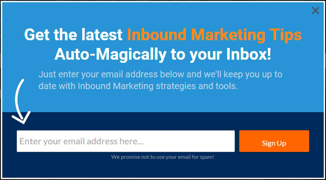
The CTA example above comes from Bluleadz, an Inbound Marketing agency that is offering tips, strategies, and tools for free, 'auto-magically' delivered to your inbox. Notice the attention grabbing headline, highlighted text, arrow leading to the email capture and finally, a 'promise not to use [their] email for spam.' This example harnesses all the most effective elements of a CTA.
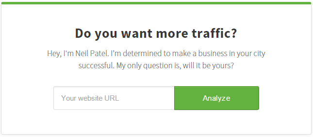
This next example comes from digital marketing, analytics and SEO guru, Neil Patel. Neil has founded many companies dedicated to increasing website traffic and this specific CTA is found on Quick Sprout, which helps visitors make better website content to grow their audience and website traffic. Notice how he intrigues visitors with a question they most certainly answered "yes" and offers a free analysis of their website. After submitting the URL, website visitors are prompted to supply their email address to receive their very own website report. A personalized website report in exchange for an email address? That sounds like a pretty good deal to me, and millions of others agree. But you’re probably thinking, “I hate when pop-ups interrupt my web browsing, so why would I bring that upon my own website visitors?”. The simple truth is, it works. In a post by WPBeginner, the largest WordPress resource site for WordPress beginners, an astounding 600% subscriber growth was recorded after implementing the OptinMonster lead generation plugin.
By creating a targeted campaign that speaks to your audience, website visitors are much more likely to happily offer their contact information. And the increases in subscribers resulting from pop-up CTAs can be mainly attributed to the fact that visitors must take some action in order to continue, either filling out or closing the form. Regardless of the selection, your content was seen - unlike stagnant sidebar forms which often go unnoticed. However, proceed with caution when using pop-ups that appear in the middle of a visitor’s session. I’ll admit that I’ve abandoned many websites without return due to being bombarded by pop-ups before even reaching the bottom of the page.
Fortunately, many leading opt-ins forms allow you to determine when and where your CTA appears. In my experience, the most effective option (and personal favorite) for non-intrusive CTAs is exit-intent technology. The exit-intent technology monitors your website visitors’ mouse movements on a page and triggers the CTA pop-up at the exact moment a visitor is about to leave your site. Pretty amazing, right? Worst case scenario: a visitor leaves your site, which they already intended to do. For everyone else, you’ll be turning deserting visitors into subscribers. As with most every other marketing medium, the only way to real gauge the effectiveness of your CTAs is to test, test, and test again. A/B split testing is one of the best methods to evaluate the effectiveness of your campaigns, where you can try two different opt-in form designs, headlines, content, and form buttons, then track the click-through-rate (CTR) and conversions to see which is working for your audience. Record your results and use that data to support and enhance your future campaigns and CTAs.
3) Make it easy to purchase
As strange as this may sound, you need to make sure that whatever you’re selling, whether it be consumer products, enterprise software or professional services, your website visitors do not need to search your entire site to find out how to make a purchase or schedule a consultation. According to a recent study by Microsoft Corp., the average human attention span is now shorter than a goldfish's. Yes, a goldfish. Our attention span of coherent thought is now down to 8 seconds. This troubling fact is due in large part to our brain's ability to adapt and change over time, resulting in a shorter attention span as a side effect of our mobile technology-driven world. Keep this in mind when you analyze your own website. If your visitors need to search for anything longer than 8 seconds, they are likely to leave without finding it. And this isn’t just speculation; I can confirm this from my own experience. Referencing back on the importance of having clear website navigation, one day I was in desperate need of a last-minute item for an upcoming trade show. I quickly searched online until I found the perfect product. After searching through the website, I was unable to determine how in fact I was supposed to purchase the product – or any product for that matter. There were no “add to cart,” “buy now,” or “purchase item” buttons or pages on the website. So what did I do? You guessed it; I immediately left the site and found the next vendor with the same product, which was very clear on how to make a purchase. To satisfy my own curiosity, I later revisited the site. I just wasn’t able to grasp how many customers this site was potentially losing, so I needed to get to the bottom of it. On the contact page, at the very bottom right hand corner of the screen, I noticed an “order form” hyperlink. I clicked the link which automatically downloaded a PDF order form with instructions on how to place an order, which included printing the form, filling in quite a bit of information, and faxing the form to the specified number. I couldn’t believe this was the only way to place an order “online.” And this all happened towards the end of 2015. The moral of the story: don’t make your potential customers jump through hoops in order to make a purchase on your website. Chances are, if they have to search for too long, they’ll be nothing more than a unique visitor statistic in your website analytics instead of a customer. Have any of these strategies worked for you and your business? Please leave a comment below, and be sure to come back for part 2 where I’ll be covering the next 3 tips to increase your website conversion rate: improving content & load speed, search engine optimization, and establishing credibility.